Read the original article on Medium:
What is the problem?
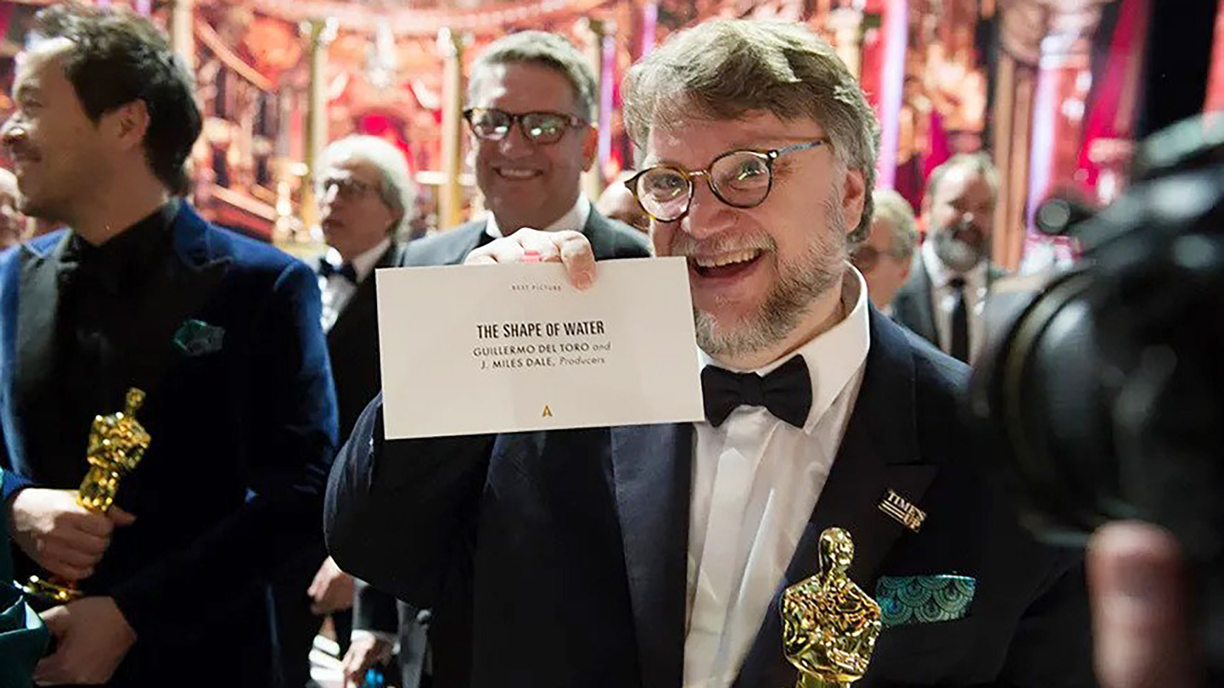
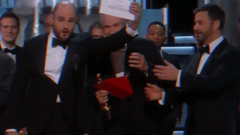
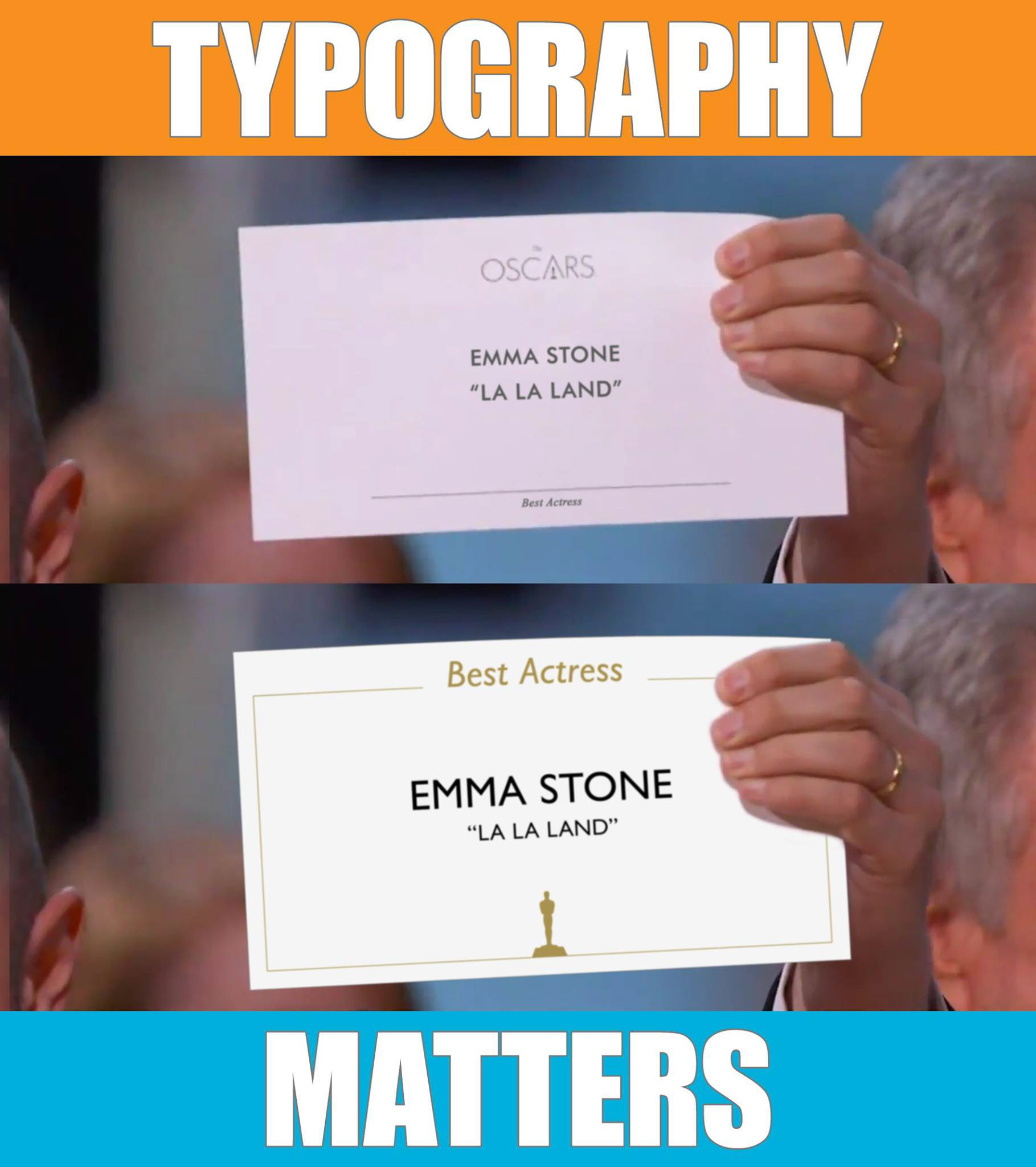
The wrong Best Picture winner was announced at the biggest award show in the world. How could this happen? One quick look at the card and it was clear to me why. It was the lack of thought and design put into the typography of the card.
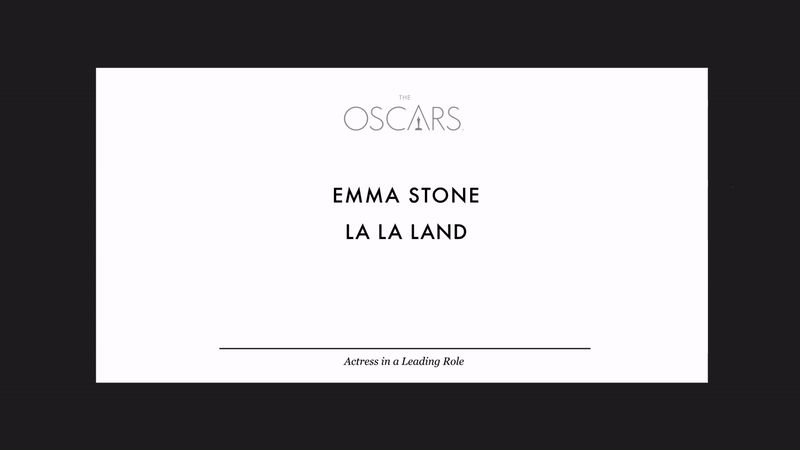
Fix #1: Hierarchical typography
People read from top to bottom. Information should be arranged in a way appropriate for the context. For a high-pressure situation like the Oscars, they should emphasize the category, then the winner, then any other relevant information.
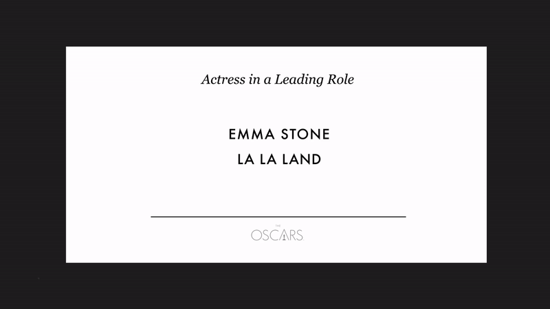
Fix #2: Adjusting the weight of information
Having the actor and picture in the same font-weight assumes they are equal. In the context of an award winner's card, the actor must be emphasized first, then the film they're in.
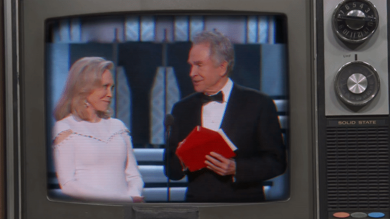
As you can see from Warren Beatty's confused face, he was unsure of what to do. If he had a properly designed card, he would've spotted the error in a few seconds and addressed that he had the wrong card, saving the Academy some embarrassment.
Sharing/marketing knowledge
I created a meme, and, turned it into a Facebook paid ad linking to my article for $6. It spread like wildfire, and let's just say that $6 investment has grown 1000X back in other design work.
Watch the video (3,000,000 people already have):
Read the republished article on Vox:
The next year
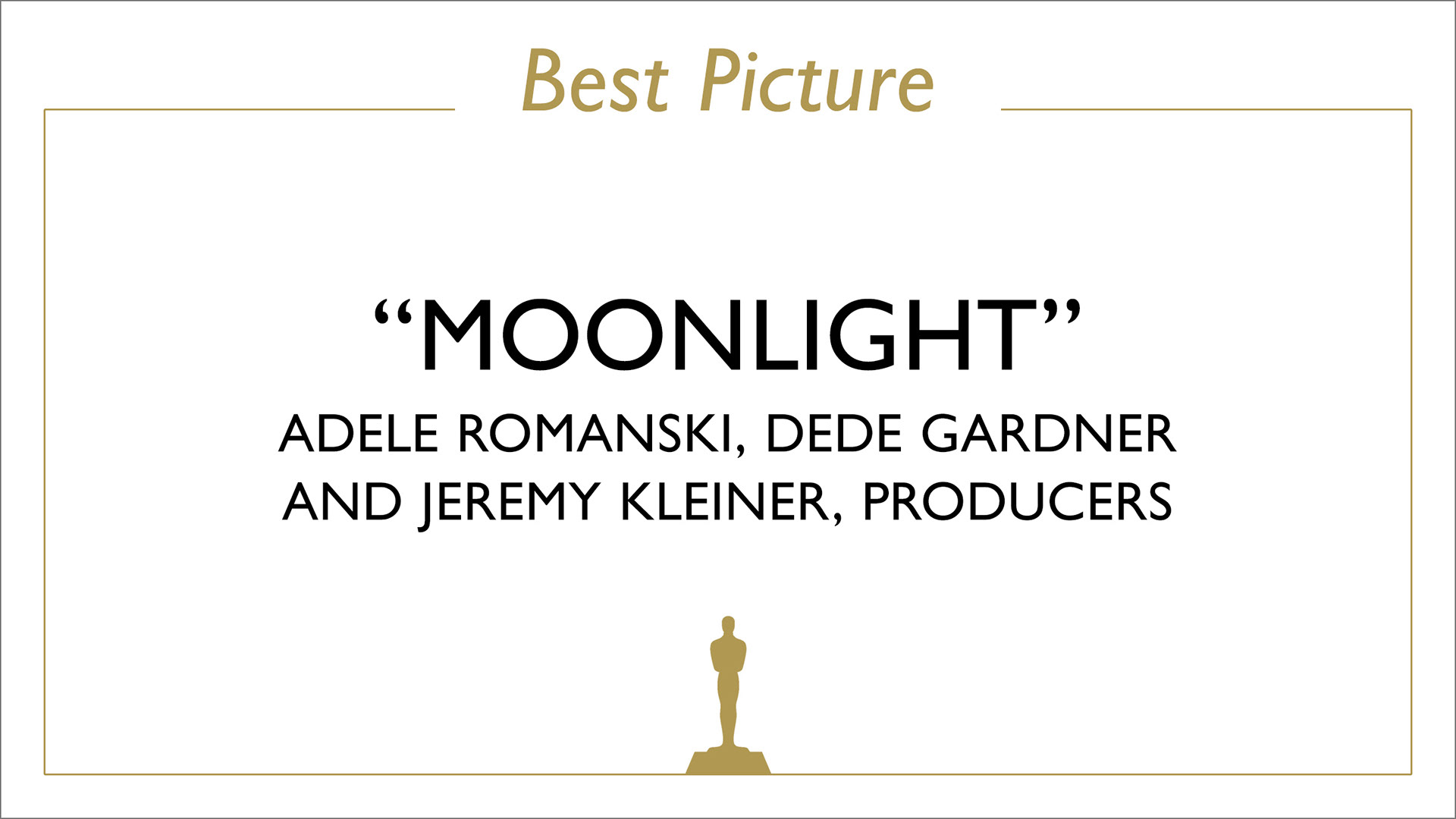
Looks like the Academy took notes.